
SAFE
Carol Christian Poell & the codification of a developed aesthetic

While I often make the claim that there is far more information on Poell’s work available than many folks on the internet would have you assume, there remains a dearth of specifics readily accessible. There are holes that, one would hope, will eventually get filled in, but short of an opportunity for extended conversation with Poell himself (and visit to whatever archive might exist in his studio), those of us interested in the work have to do a lot of piece-meal guesswork to organize a larger picture.
I say this all to point out that much of what I will write in the following is full conjecture–I have tried to base my statements on the information that I have available, via research and discussion, but it is entirely possible that I am just flat out incorrect in some of the things that I state below. I am willing to accept that, it’s not something that discourages me. For me, a collection of quantifiable facts pales in comparison to what a, shall we say, literary engagement with the “texts” of Poell’s work have to offer. This “literary” engagement also, of course, extends into the realm of actually wearing the clothing when possible. But, with or without direct access to quantifiable “fact,” the texture of Poell’s project & how it extends into the world continues to fascinate me, even as I wax and wane in my enthusiasm for my relationship with the CCP community.
Without any second-guessing of the idea, Carol Christian Poell’s 2005 collections can be considered as a distinct split in his body of work. Because of my time engaging with Grotowski, I find it helpful to break a long-running body-of-work into “phases” as a way to organize my own thinking. This sort of fracturing is not an insistence that there is no overlap between the various temporal stages of the work, but rather should be considered as a thematic with rhizomatic linkages across the entire oeuvre.
I break Poell’s work into the following phases:
Beginnings (MALE FW94/95’s Non-Intended Collection - 00’s Form/Material/Color)
Narrative & Conceptual Engagements (FE-MALE AW99/00’s Trilogy of Monotypologies I & MALE FW00/01’s Pure/Impure - SS04’s Mainstream Downstream)
Aesthetic Maturation (FW04/05’s Instant Collection - 10’s Dead-End)
Questions & Reconsiderations (11’s In-Between, which has had additional “capsule” releases periodically up through the current year of 2025)
As can be seen in the “map” above, I take AW04/05 as introducing the third phase of Poell’s body-of-work, which I am casually labeling as “Aesthetic Maturation.” Contrary to earlier experiments, Autumn/Winter 04/05’s INSTANT COLLECTION and Spring/Summer 05’s DISPOSSESSED collectively introduced specific methodologies and construction techniques that guided his design language for years to come. This is especially apparent in his developing a technique of object-dyeing leather (and other materials), which is perhaps what Poell is most recognized for in all of his work. Before AW04/05 (with potentially a few exceptions in SS04), all the colorful leathers that Poell used were likely dyed by tanneries and constructed after dyeing, or in a few instances (notably in the 03/04 seasons) the leather was painted or “glazed.” While Poell did not necessarily invent object-dyeing (often attributed to Massimo Osti of Stone Island and CP Company), his unique technique for object-dyeing leather first made its appearance at this point.
In terms of garment construction, 2004/2005’s seasons introduced a much more pronounced & articulated use of wide-gapped overlock stitching (a technique that would later be further refined into a scar stitching, eventually moving towards more rarefied experiments like chainseams and invisiseams). The same year also found Poell introducing unlined tape seamed jackets and outerwear, serving to both question inherited modes of tailoring as well as drawing specific attention to the craft going into the tailoring itself. While many other “avant-garde” designers had worked with “deconstructive” approaches to garment-making in order to, in an academic postmodern fashion, question the “idea” of construction itself, Poell arguably diverged from these exercises in his insistence of pointing towards (instead of away from) the construction itself.
Upon its initial release (records show that Lift Ecru held an exhibition in August of 2004 for the AW04/05 season and March of 2005 for SS05), due to the word SAFE being stamped into leather on various pieces, these collections were occasionally referred to as the SAFE collection(s) on web forums. However, the usage of this stamp continued beyond these seasons and can still be found imprinted upon certain pieces to this day. This initial mark led to some confusion that one can still see evidence of; both in Archival listings that insist that a piece is from the “Safe” collection, and also older forum posts where it was suggested that the reason for continued use of the stamp was “leftover material.”
Despite this confusion, there is a variety of possible modalities one can read into the continued inscription. Through his entire oeuvre Poell seems to be singularly obsessed with garments that point towards “safety” – even in the current In-Between capsule one identifies exposed prosthetics on order-sheets as either “hidden protection” or “open protection.” But further referential iconography permeates the collections: leather vest bags being based on Military Life Vests, a goatskin condom, belts using seat belt closures, etc. The “Safe” stamp can also be considered a more conceptual “logo” divorced from capitalistic insistence upon identity (“branding”), instead pointing to an insistence upon the garment itself rather than what it might point to.
AW04/05: Instant Collection
The title of Poell’s watershed AW04/05 season is a perfect example of the somewhat bitter irony carried throughout his oeuvre: the solidification of techniques that Carol had been experimenting with for years can hardly be considered an ‘instant’ process, and even the temporal duration of the production itself is at the antipodes of the instantaneous. However, as Lift’s website suggests, perhaps what is meant by “instant” is how the garments themselves communicate their construction instantly: overlock and contrast stitching on garments call attention to seams, unlined garments pointedly reveal construction, and uneven dyeing (refusing the “flatness” normally associated with luxury brands) points to a dye techniques.
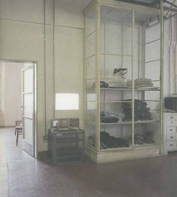
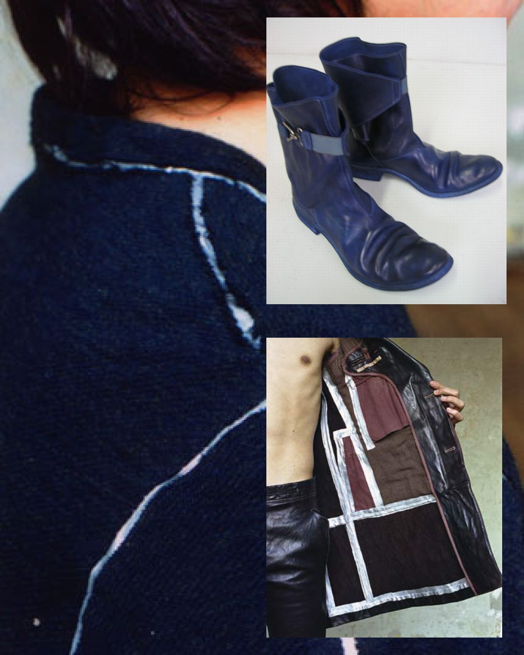
The presentation for this season’s lookbook points to the same: a large glass paned cabinet (which can elsewhere be seen situated in CCP Srl’s studio, noted as coming “from the forensic medicine department of the University of Vienna”) is the “environment” the model is positioned inside of: the cabinet encloses, but makes what is inside visible, instantly, without having to open the doors. Other images have the model gesturing or styled in a way that draws attention to the “edges” of a garment: an unlined jacket is held open to show the tapes seams, pants are tucked into wrap boots to show the break in construction of the shaft, shirts are shown with collars and cuffs partially detached.
Editorial copy describes the construction as “a little rugged, a little fragile” – though the insistence of fragility is a falsehood. The irony of tape and contrast stitching revealing a garment's seams serves to both elaborate the garment’s construction but also reveal the inherent truth of all garments constructed out of multiple pieces of whatever material: the garment is something that has been put together, and as such it can be pulled apart. The description of ruggedness points towards the materiality itself: in the same way the signifiers of construction point to edges and boundaries, the materiality of leathers and fabrics used insist upon the de-reification of a given material, rather than a push to eradicate the body of a material itself.
The season also introduced two remarkably vibrant colors: Color 15, a dark violet red/magenta, and Color 16, an electric blue/purple that reads as indigo, evocative of both Rudolph Schwarzkogler’s metaphysical use of color and a flamboyant sense of royalty. Grey and Brown round out the palette, with white and black of course being available as foreground or background of an outfit’s resultant pictorial plane. To me this is one of Poell’s most well-considered fall/winter palettes, cohereing into a true aesthetic statement that is not seen very often in the world of fashion.
While the collections immediately preceding SS04’s Mainstream Downstream highlighted experimental fabric weaves playing with warp and weft, in AW04/05 fabrics like DIAGON and LOCH elaborate on the conceptual implications of the label INSTANT: the visual result of a process is implicit both from their naming and by merely looking at the fabrics. An insistent animality also returns, both in the use of HAIR, a (presumably) bovine leather with the hair of the animal kept on the hide during tanning, offered both as insulation in a pair of boots and a jacket, but also on the exterior of a pair of sneakers (an effect that would later be achieved with much more gravitas with the use of Pony). A heavier cotton-wool blend named ELEFANT also makes an appearance.
These benign elaborations hopefully highlight the conceptual bent that would stay with Poell throughout this entire third “phase” of his career – there is an almost uncanny conceptual integration between execution and aesthetics: each informs and elaborates the other, with neither element (technical execution or aesthetic consideration) feeling superfluous or tacked on. The vibrancy of colors 15 & 16 exist exclusively because of the experiments in object-dyeing, and the aforementioned “rugged fragility” is also not an after-the-fact insistence (something found in “darkwear” aesthetics like intentionally torn hems), it is rather the result of the experimental construction techniques.
SS05: Dispossessed
For the Spring/Summer 05 collection Poell again plays with the permutability of linguistic meaning in the collections title. Here “Dispossessed” refers both to the mode of some garment’s construction, as well as a sort of aestheticized nomadism, reflected in “slouchier” silhouettes (as in AW04/05 the result of the attention to garments’ textures) and some of the garments themselves: collapsible derbies that can be easily stored in baggage, object-dyed leather “hobo bags” and formless ponchos. The environment of the presentation is a tent constructed out of the rice-bag material that CCP garments ship in, again echoing the title by setting the wearer of the garments apart from the world while also obliquely pointing to the ‘tent cities’ homeless populations cultivate. As the lookbook photos show, the depth of the setting allows for the play of perspective, allowing both figures and garments to appear at varying scales depending on distance forward or backwards. The setting also allows shadows to paint silhouettes in a way often considered at odds with Poell’s insistence on the garment in itself.
While there had been conceptual overlap between some of the MALE & FE-MALE collections in the early 00s, SS05 was the first time that both MALE and FE-MALE collections were fully integrated, to the point where some items are marked as both MALE and FE-MALE inf their product codes, revealing a true unisex intent. Similarly, while the questioning of inherited gender roles is tamped down in comparison to some of the earlier seasons, there is an implicit back-and-forth identifiable in various garments: the shaving brush necklace is presented as a FE-MALE accoutrement, while the construction of a “sleeved waistcoat” offers a distinctly feminine neckline if one insists on being locked into a gender binary.
SS05 introduced a unique lighter color palette, novel especially for leather pieces, where the use of kangaroo leather allowed better absorption of lighter colored dyes. While the specific color dyes used are mostly no longer available (unlike some other earlier season’s colors, none of these seem to have been brought back since their introduction), there is a visual coherency to what was available in tune with the palette of current offerings. SS05 introduced a warm-grey green very different from the more recent Col6, Col12 and Col36. This green was joined by optical white fabric pieces (pants with ruched flies and tailored long coats, two-part collarless blazers and translucent knits) and the “dirty white” leather that Carol would become known for, as well as continuing use of the maroon col15 first introduced in AW04/05. The lighter color palette allows garments in the collection to highlight texture that is often obscured on darker garments.
While Carol had worked with denim previously, it (seemingly) wasn't until SS05 that the KIT fabric, a proprietary weave developed by CCP (& now the mainstay of Carol’s denim) was introduced. The pattern used for the KIT jeans have gone through many permutations since their introduction, but the overlock stitching, still present on the Dead-End pattern version of KIT jeans currently in production, is present from this initial introduction. Additionally, for the first and last time since 2002, a transparent leather is used, this time in the construction of a bomber jacket.
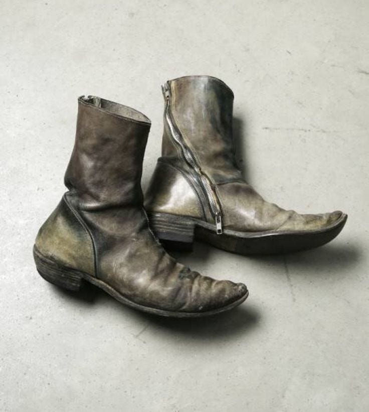
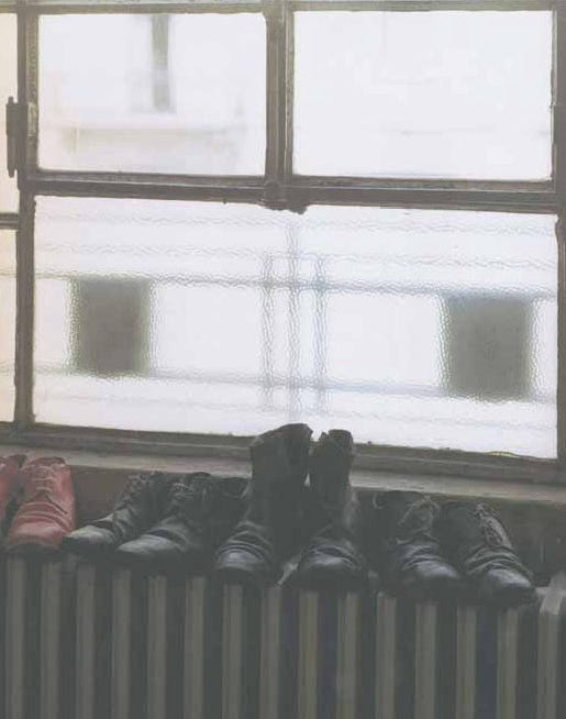
In terms of footwear, SS05 marked the release of the diagonal zip boots (colloquially known as “nados”), but research shows that it was the “hawkeye” boots (an ankle boot with an elasticized closure attaching to a circular hook, pulling a flap of leather against the ankle) that garnered most attention contemporaneously. The hawkeye boots were a direct precursor to both SS08’s “rainboots” and 09’s Folded boots, but aside from having a lower shaft (like the OG rainboots), it also featured a cuban heel. The one image of a pair of diagonal zip boots (potentially) from SS05 also has more of a cuban heel than the heel shape more recent Nados have, but in speaking to individuals who were buying from the brand in ‘05, it was pointed out that the normal heel was seen much more often. When considering images from the collection’s lookbook, one of the most striking elements is the “collapsible” derbies, unisex footwear that can be flattened, perhaps in order to take up less space in luggage while travelling.
After the two 2005 collections introduced a watershed of new & extremely well-received pieces, there was no collection released for AW05/06. According to TheFashionSpot user Raijin, “...his reason for taking a season off may be the industrial espionage of his research that happened right before the [AW04/05] collection [...] Someone broke into [Carol’s] lab and stole 6 months worth of his research into new fabrics and dying methods, however they didn't bother with the money lying around.” This is one of many pieces of lore that have worked their way into a cultural narrative history of Carol Christian Poell. But was it true? Or instead was the situation more like today; the studio is so swamped with orders it seems that it is delaying the production of new work. No one but those who worked at the studio at the time can say for sure.
With all of the above, the major point I want to make here, that brings Poell’s body of work into it’s Third Phase, is how the experimental approach to materials has directly resulted in the so-called Poellian aesthetics. While in 2025 many of the aesthetic affectations that made their way into Poell’s body of work have been endlessly repeated by lesser designers aping something merely for its visual impact, it has always been the research and experimentation with materials and construction that has pushed the Poellian aesthetics forward. Form may not always follow function, but it does indeed follow novel research.
To quote Poell himself, “The problem today is that we don’t need quality anymore. Primary needs are more than fulfilled — at least in the civilized world. Everything around us has a standard never before seen in history. And yet, the most beautiful moment in my work is when I can say: this piece has turned out well. It is good. I allow that it has a certain quality. It's not enough that something looks beautiful — it must also possess a deliberate materiality.”